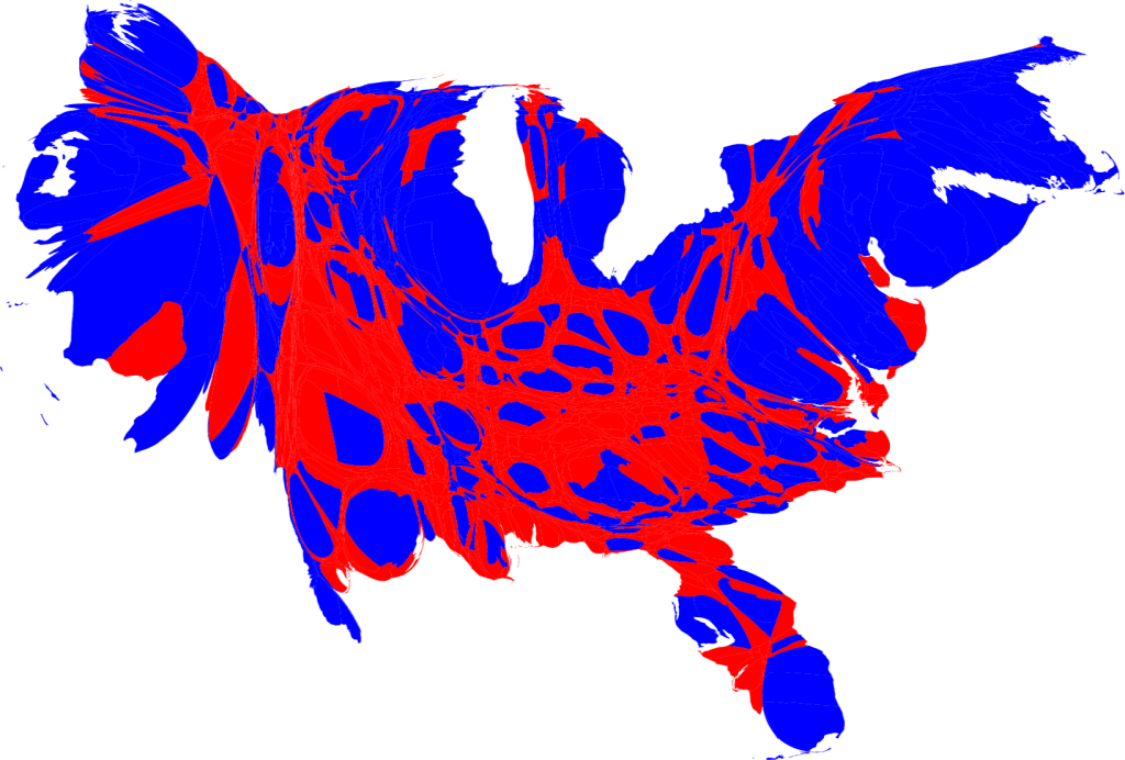
The next map I chose was created by Mark Newman, a Professor of Physics at the Center for the Study of Complex Systems at the University of Michigan. It is an area cartogram which assigns the size of each county based not on physical area, but on population. The counties are then labeled red or blue to indicate how they voted in the 2008 presidential election, blue for Barack Obama and red for John McCain. What I liked about this map was how it dispelled traditional notions about political parties in the United States. People often talk of a conservative, republican “heartland” of the country bordered by the liberal, democratic coasts. However, this map shows the large pockets of democrats within the supposedly conservative center, as well as conservatives in the coastal regions. I thought it was a very interesting way to better display the political beliefs of the actual population, as opposed to counties or states.
No comments:
Post a Comment