Neogeography represents a new and exciting development for the field of geography but it does have its pitfalls. Neogeography is essentially the democratization of mapmaking, made possible by new technology. Before the widespread prevalence of powerful home computing, easy to use software and the internet, the creation and editing of Geographic Information Systems was limited to people who had both the training and hardware to use ARCGIS and similar programs. Now, however, anyone with access to an internet connection can use google maps to create and edit multiple layers of spatial data, effectively creating a GIS. One of the greatest advantages, and also largest challenges, of this neogeography is that it is open to everyone.
The new access to map making allows for a much wider variety of spatial and geographic data to be shared. Groups and individuals who would have never before thought to create GIS and maps now are able to with relative ease. The GIS they create is then available for anyone to access online, increasing the total knowledge available. This open access, however, is the main drawback of neogeography. When everyone can create maps and GIS anonymously, the pressure to have completely accurate results is lessened. In addition, since neogeography involves the participation of mainly amateurs it could lead to a higher rate of mistakes and deliberately false data, which might hurt researchers trying to analyze the data. However, for the most part this democratization of geographic knowledge has been a plus. Neogeography is part of a larger trend where previously hard to attain skill and knowledge is made accessible to the general public through technology. Hopefully, like other previously esoteric skills such as digital photography, filmmaking and music producing, it will make what was once expensive and hard to access easily usable. This will encourage members of the general public to get involved, leading to a wide variety of data rich maps. While it is still to early to speculate where neogeography will lead, I believe one of the ultimate end points could be a worldwide system of geographic information, where previously individual geographic knowledge and information is available for access by all. Neogeography, if it can overcome the problem of accuracy, will be able to bring maps and geography into the 21st Century and give entirely new groups of users access to a wide variety of geographic information.
View Holmby Park Run in a larger map
Friday, April 20, 2012
Thursday, April 19, 2012
Week 2 Lab: Exploring the Beverly Hills Quadrangle
Lab Answers.
- The name of the quadrangle is the Beverly Hills Quadrangle.
- The adjacent quadrangles are Canoga Park, Van Nuys, Burbank, Topanga, Hollywood, Venice and Inglewood.
- The topography for this quadrangle was initially compiled in 1966.
- The North American Datum of 1927 and 1983 as well as the National Geodetic Data of 1929 were used to create this map.
- The scale of the map is 1:24,000.
- 5 centimeters on the map is 1,200 meters on the ground.
- 5 inches on the map is equivalent to 1.894 miles on the ground.
- 1 mile on the ground is 2.64 inches on the map.
- 3 kilometers on the ground is 12.5 centimeters on the map.
- The Contour interval is 20 feet.
- The Public Affairs Building is at 34° 4’ 22” N Latitude and -118° 26’ 24” W Longitude (37.073°, -118.44°).
- The tip of the Santa Monica Pier is at 34° 0’ 25” N Latitude and -118 ° 29’ 56” W Longitude (34.007°, -118.499°).
- The upper edge of the Franklin Reservoir is at 34° 6’ 11” N Latitude and -118° 24’ 49” W Longitude. (34.103°, -118.414°).
- Greystone Mansion is at 580 feet and 177 meters elevation.
- Woodlawn Cemetery is at 140 feet and 43 meters elevation.
- Crestwood Hills Park is at approximately 720 feet and 222 meters elevation
- This map is in UTM zone 11.
- 3763000 meters North and 362000 meters East are the UTM coordinates for the lower left corner of the map.
- Each cell contains 1,000,000 m2, or 1 km2.

- The magnetic declination of the map is 14°.
- The stream between the 405 and Stone Canyon Reservoir flows south.


Thursday, April 12, 2012
Map #3: Federal Land Ownership in the United States

The last map I selected was created by David M. Kennedy, Professor of History at Stanford University. It shows the percentage of land owned in each state both numerically and with a smaller, red image image of the state within the actual state. What I find interesting about this map is the heavily skewed distribution. Colorado and the Rocky mountains seem to form a dividing line as far as government land ownership is concerned. While you can read about the differences in historical development and federal involvement in states, it is most striking to see the difference between the eastern and western United States in map form. I thought it was also cool how they included a smaller red image of states indicating the amount of land owned by the United States government, it makes clear just how much area 40% or more can be.
Map #2: Cartogram of the 2008 US Presidential Election
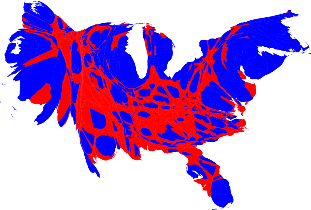
The next map I chose was created by Mark Newman, a Professor of Physics at the Center for the Study of Complex Systems at the University of Michigan. It is an area cartogram which assigns the size of each county based not on physical area, but on population. The counties are then labeled red or blue to indicate how they voted in the 2008 presidential election, blue for Barack Obama and red for John McCain. What I liked about this map was how it dispelled traditional notions about political parties in the United States. People often talk of a conservative, republican “heartland” of the country bordered by the liberal, democratic coasts. However, this map shows the large pockets of democrats within the supposedly conservative center, as well as conservatives in the coastal regions. I thought it was a very interesting way to better display the political beliefs of the actual population, as opposed to counties or states.
Map #1: Losses of the French Army in the Russian Campaign 1812-1813

This map, probably one of the most famous in existence, was created in 1869 by Charles Minard, a French civil engineer who also created a wide variety of maps. This one shows the disastrous result of Napoleon’s 1812-1813 Russian campaign. What I really like about this map is the wide variety of information it conveys. The colors show the direction of the army (brown invading, black retreating) overlaid on a map of Russia. In addition, the width of the line shows the size of the army, and as losses increased over time the line thinned. Numbers along the side of the line show the exact number of troops at certain points. Finally, the bottom of the map contains a temperature readout which shows the temperature at a variety of locations during the retreat. This map does an outstanding job of providing you with a variety of information that allows the viewer to really understand what was happening as the campaign progressed: the army went deeper into Russia, losing massive amounts of men, and by the time they decided to retreat winter had come and even more men were lost. I found the way that this map told a story through the information it gave very cool, and that is why I chose it.
Subscribe to:
Comments (Atom)